
The Interface Problem Nobody Is Talking About
We built the most powerful AI tools in history. Then we handed them to people who have no idea what to type.
The people who need these tools most (office managers, claims adjusters, social workers, small business owners) are staring at a blinking cursor. A lot of them have already stopped trying. That's a design failure, not a model failure, and our industry has been slow to own it.
The blank box problem
A company buys an AI platform, rolls it out, runs training, sends the tips email, and watches adoption flatline. The model usually works fine. The interface is a text box and a cursor. For designers, PMs, and engineers, that's an invitation. We know what to ask. For a dental office manager or a nonprofit program director, it's a wall. They don't know what the system can do, what happens when they hit enter, or whether they'll have to explain the result to their boss.
We built that box for ourselves. I've spent the last couple of years looking at products that get past it and products that don't. Nine patterns keep showing up.
Nine patterns that hold up in the field
Outcome-first language
Most teams describe the machine: "IVR Flow #3: RUNNING. Intent classification active." The better version describes the user's world: "Your appointment line is active. Handling calls automatically." Same backend, different copy, and the second one only works if every label, status, and notification is written from the user's job, not the engineering diagram. We slip into system-speak constantly. If a non-technical user can't read a line of UI and know what it means for their afternoon, rewrite it.
Approve before action
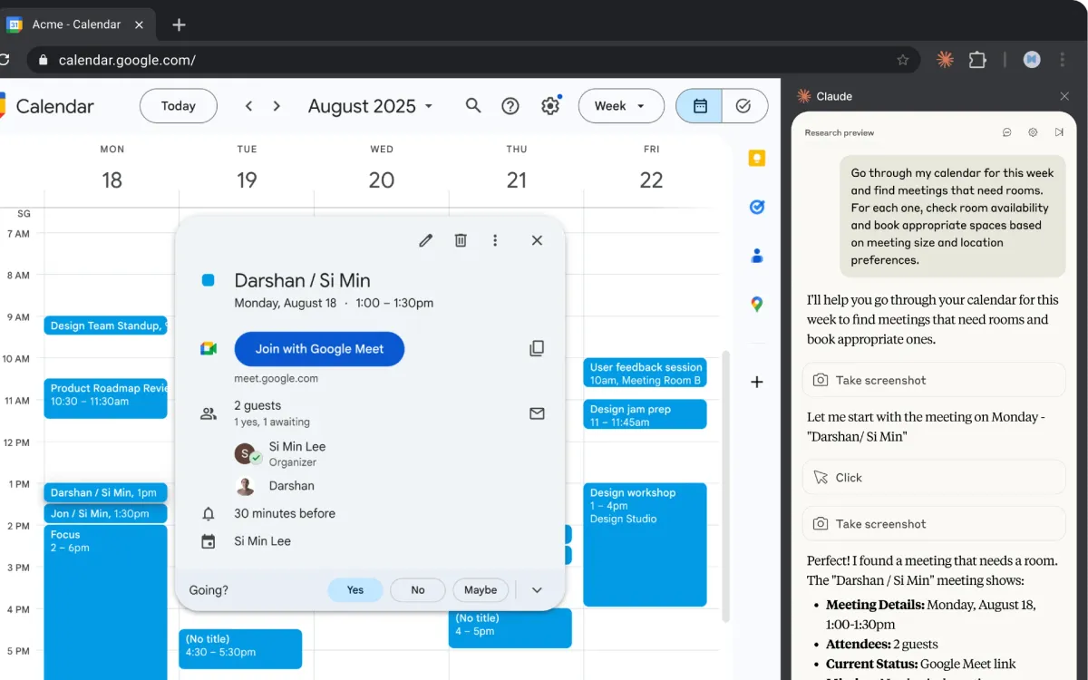
Non-technical users often aren't blocked by capability. They're blocked by not knowing what the AI will do next. The architecture that fixes that: draft the email, book the slot, queue the message, then wait for explicit approval before anything runs. Trust builds in repetition. The first approved appointment confirmation is nervous; the tenth is routine. Let people reject an action with a reason ("I'd rather call this patient myself") so the system can learn from it, beyond just logging a denial.
The setup interview
Enterprise onboarding is still mostly a form you fill out before you understand why the fields matter. Replace it with a short conversation: preferences, context, how you actually work. "When you review a contract, what do you look at first?" beats "select jurisdiction from the dropdown." The interview configures the system and teaches the user what the product can do without a manual. We already run good intakes in discovery; we rarely run them at signup.
Show the work in plain English
When an agent is searching records or checking calendars, people need to see progress without reading API logs. "Checking your calendar for the next seven days… found three open slots… sending confirmation to the patient" beats "Processing…" Keep a plain summary visible; put routing scores and classification detail behind a disclosure for the few who want it. Progressive disclosure isn't new. We just haven't applied it consistently to agent transparency.
Plain-language output first
Models emit intent labels, confidence scores, entity tags. Helpful in a debug view. Useless on a call log a front desk manager has to act on. Lead with something like: "Maria called to reschedule her cleaning. She's flexible on timing, prefers mornings, has been a patient for twelve years." Put the structured fields behind "show system detail." Write for whoever has to do the next human step.
Permissions the user already has
The assistant should only reach what the logged-in user can reach. That's table-stakes security, but it's also UX: the AI isn't a backdoor, it's a faster version of the same role. Say that on the screen where work happens, beyond burying it in the privacy policy. It costs little and changes how willing people are to try the tool.
Delegate like a colleague
Frame the interaction as delegation, not configuration: "Handle appointment confirmations for the next two days," "Flag calls where someone mentioned pain," "Draft a reply to this billing complaint." People already know how to give instructions to another person; the trust model and definition of "done" are familiar. Get the metaphor right before you polish the chrome.
Toggle-on workflows
The worst moment is the first one, before anything has worked. Pre-built domain workflows (appointment reminders on, emergency calls routed to on-call, Friday billing summaries to the practice manager) let someone flip a switch instead of inventing a prompt. Ship a win before you ask for setup depth. Configuration can come after trust.
Explain the boundaries up front
Before someone touches the product, three minutes of plain conversation: what runs on its own, what always asks permission, what it will never do. "Appointment calls get handled; billing disputes get flagged for you." Skip that and you buy months of support tickets and adoption charts nobody can explain. Teaching the mental model is part of the product, not onboarding fluff.
Where these patterns show up
Canva
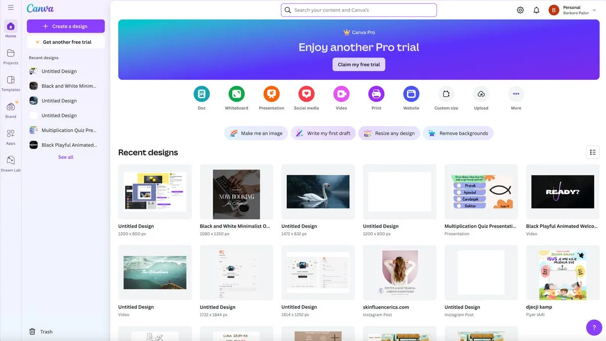
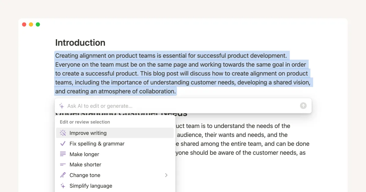
Canva puts AI inside tasks people already understand: expand a photo, reflow a layout for Instagram, tighten copy from a highlight menu. The mental model stays "I'm making a design," not "I'm operating an AI tool." That's outcome-first language and toggle workflows at consumer scale.
Duolingo
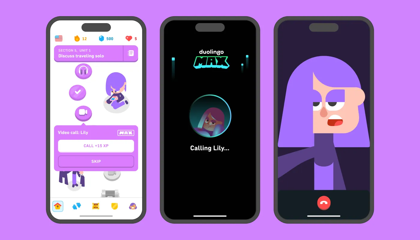
Duolingo Max changes how it coaches depending on whether you're flying through a lesson or stuck. Enterprise software rarely does that. Same error copy for a frustrated user and a curious one. If someone has rejected three AI suggestions in a row, the UI should notice.
Khan Academy (Khanmigo)
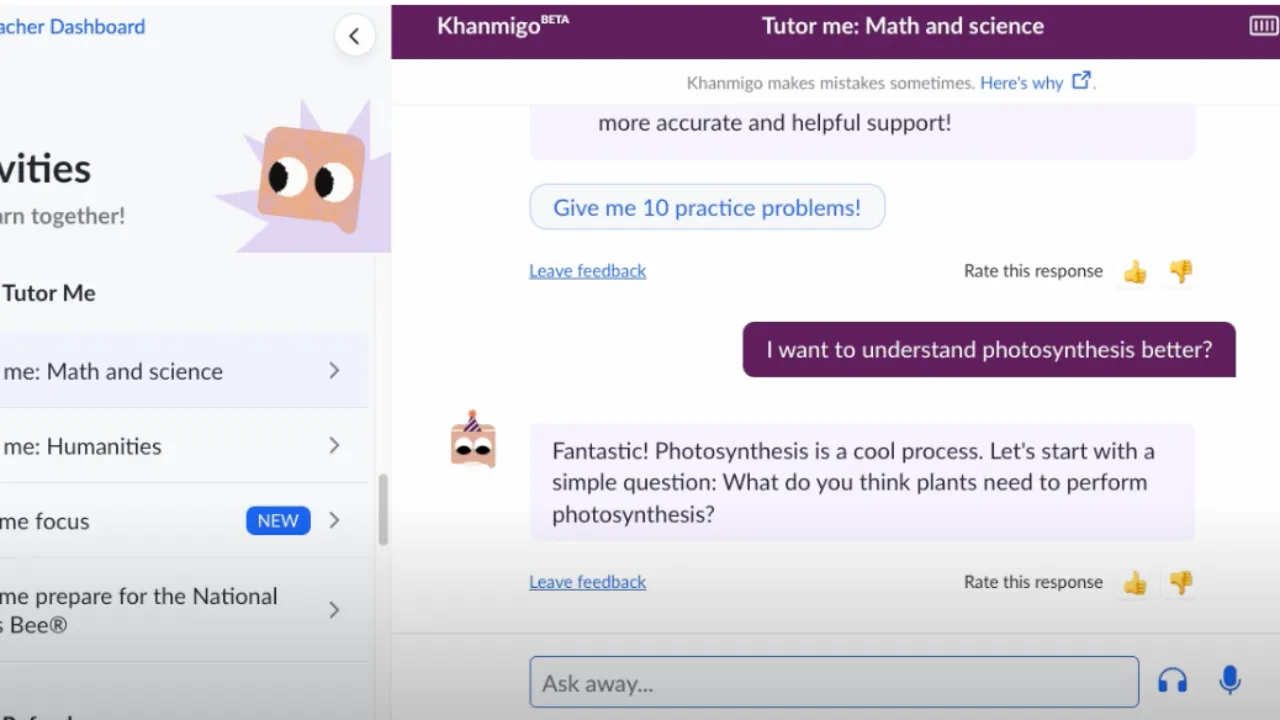
Khanmigo won't hand over the solution. It asks what you've tried, what you already know, and keeps guiding. That choice matters anywhere the goal is judgment, beyond mere completion. Capability-building and dependency-building need different interfaces; most teams haven't picked which they're building.
Glean
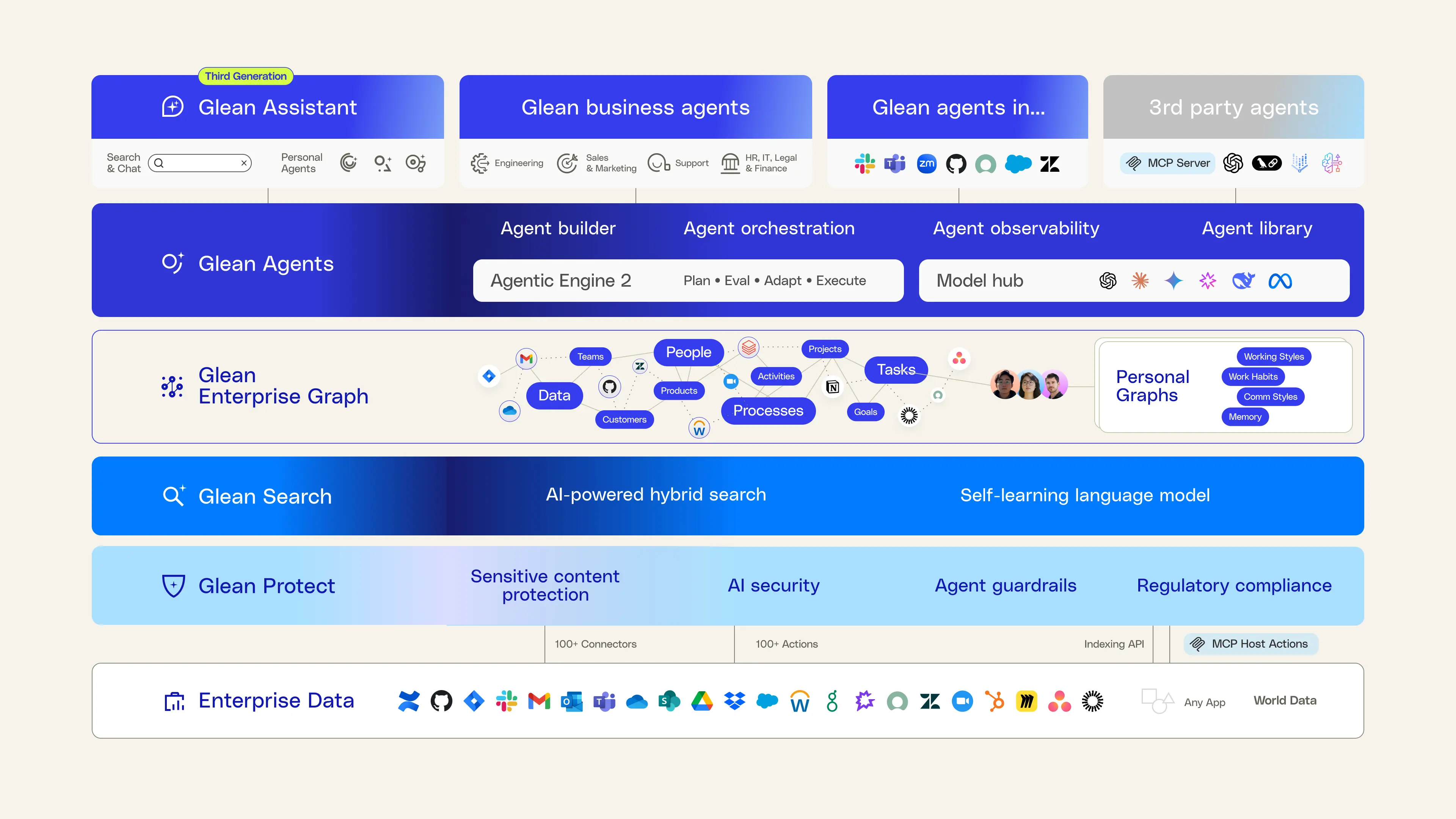
Most assistants wait for a question. Glean surfaces weekend changes against your projects when you open the laptop Monday. Proactive AI lives or dies on calibration. Too much feels like surveillance; too little is search with extra steps. Nobody has nailed the middle yet.
Salesforce Agentforce
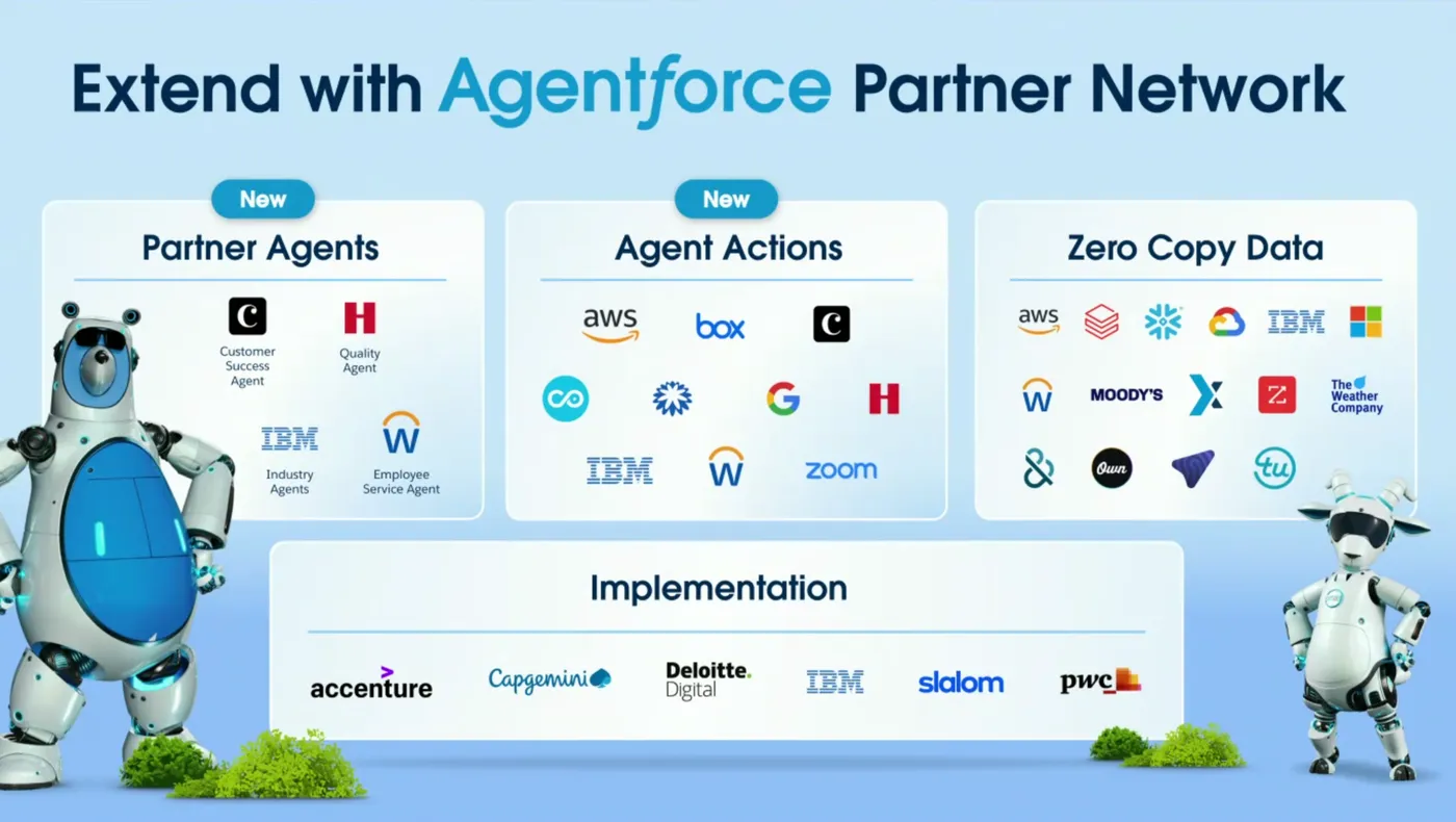
Agentforce renders AI answers as lead cards and action buttons, not a separate chat skin. When you introduce AI to a non-technical org, reuse the visual language they already live in. Asking them to learn a new UI and a new technology at once is a tax you don't have to collect.
ServiceNow
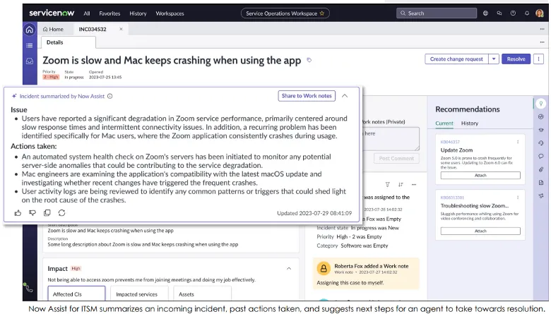
Now Assist lets people say "submit a hardware request" or "show open tickets on my team" instead of hunting through menus. For users who never memorized the hierarchy, that's a real reduction in friction, and any product with deep navigation could borrow the pattern.
Abridge
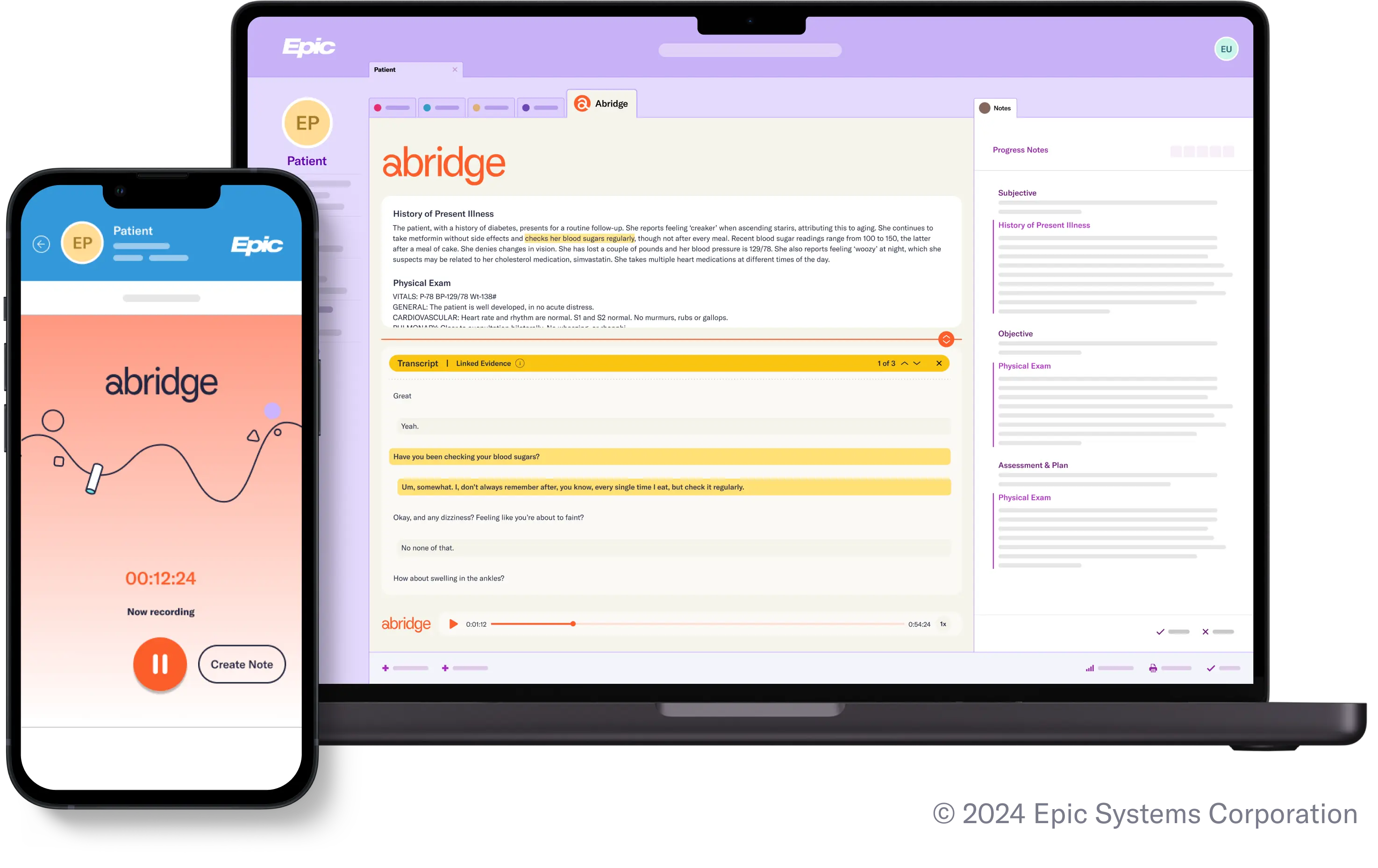
Abridge listens to the visit and produces the note. The clinician doesn't prompt it; the patient may not know it's running. For some jobs, the right interface is none. Worth asking which steps in your product could disappear the same way.
What actually matters
The point isn't to make AI easier to operate. It's to make the user's job easier, with AI as infrastructure. Canva wants a design finished. Glean wants an answer found. Abridge wants documentation off the doctor's plate. The office manager should think "phones are handled," not "I'm on an AI phone system."
Start from the outcome someone needs today and work backward. Invest in trust (approval flows, readable output, visible permissions) before you stack features. Spend real time on the first three minutes of mental model. Write UI copy in the user's domain language. Hide the AI wherever you can.
We over-built the engine. The work now is the vehicle non-technical people can actually drive.
References
- Smashing Magazine. "Practical Interface Patterns For AI Transparency." May 2026.
- Nielsen Norman Group. "State of UX 2026: Design Deeper to Differentiate." January 2026.
- Gothelf, J., & Seiden, J. Lean UX: Designing Great Products with Agile Teams. O'Reilly Media, 2016.
- Raskin, J. The Humane Interface: New Directions for Designing Interactive Systems. Addison-Wesley, 2000.
Weekly
One email a week on product experience and AI-enabled delivery
What I'm working on, what broke, and what I'd do differently. Written for people running product organizations.